|
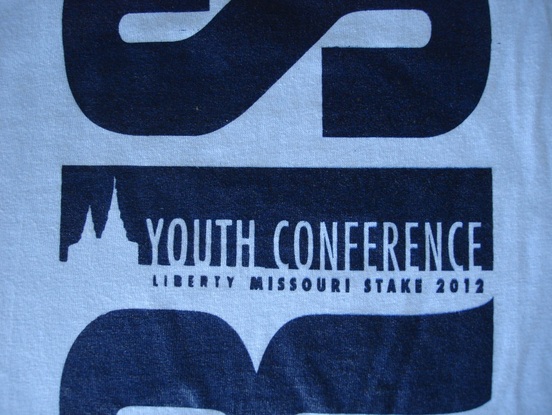
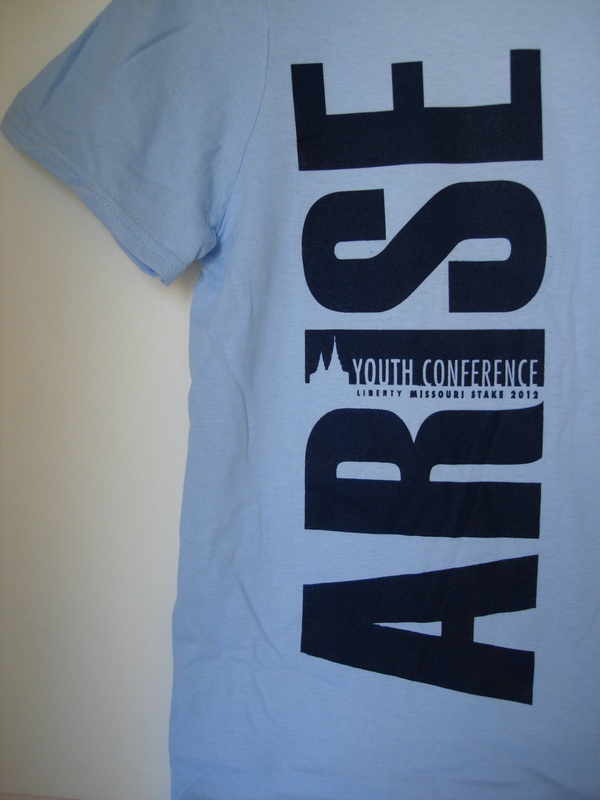
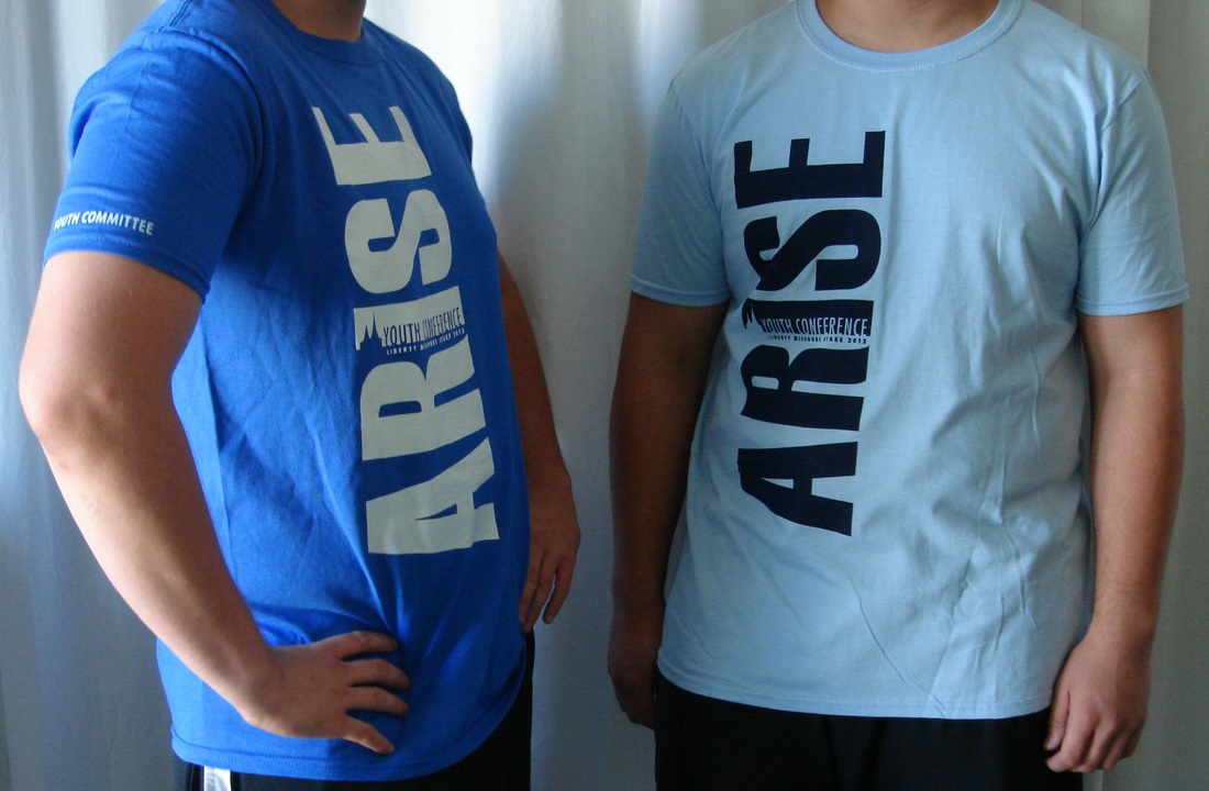
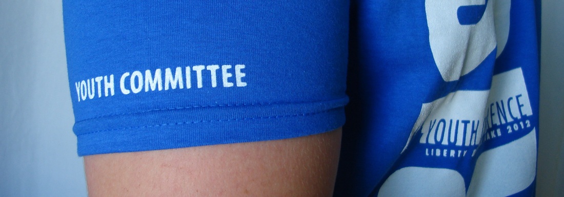
Design happens all the time around here. It's always something. Here's a sneak peak at the t-shirts I designed for youth conference. The kids get them tomorrow. Arise was our theme so I turned the word on its side to give it that feeling of moving upward, arising. I also designed the temple after the new Kansas City Temple and used negative space for it. Two different design colors. Light blue for the majority of youth and royal blue for the youth who are on the planning committee. "Youth Committee" on the sleeve for a little distinction. Doan's Printing did the shirts, you can find them here.
7 Comments
chels
8/8/2012 11:21:29 pm
Those rock! You are skilled!
Reply
izzy
4/28/2015 05:35:00 am
er ... you know this says "arse", right?
Hi Izzy,
Reply
Gale
7/17/2016 03:10:07 pm
I saw "arise", and "arse" didn't occur to me even though I've heard it enough. What I did see was some killer graphic design. I came here looking for inspiration to make a couple of stylish EFY shirts. The shirt designs are pretty plain, and my daughter wants a shirt that she feels like wearing after the week is over.
Reply
5/14/2021 11:19:05 am
Thank you for sharing this amazing youth conference t-shirt that you designed! I love how the wording is turned to the side. I am looking for a youth conference in my area and would love a t-shirt as well!
Reply
6/19/2022 11:07:40 pm
Very much appreciated. Thank you for this excellent article. Keep posting!
Reply
Leave a Reply. |
Shannon's Studio
�
Archives
March 2023
|


